Colored Text Pill
A colored text pill shows a short label on a colored, rounded background, e.g. for tags or categories. It lives
in package presentation/ui/tags. The text is always black, so choose light background colors. For status
information prefer tags.StatusBadge, which uses the theme text color on a neutral background and shows the
semantic color as a small dot, so that it is readable in light and dark mode.
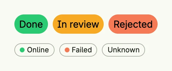
VStack(
	HStack(
		tags.ColoredTextPill(SG0, "Done"),
		tags.ColoredTextPill(SW0, "In review"),
		tags.ColoredTextPill(SE0, "Rejected"),
	).Gap(L8),
	HStack(
		tags.StatusBadge(SG0, "Online"),
		tags.StatusBadge(SE0, "Failed"),
		tags.StatusBadge("", "Unknown"),
	).Gap(L8),
).Alignment(Leading).Gap(L16)
Constructors
| Constructor | Description |
|---|---|
func ColoredTextPill(color ui.Color, text string) TColoredTextPill | Creates a pill with the given background color and text, with default padding and rounded borders. |
func StatusBadge(dot ui.Color, text string) core.View | Creates a neutral badge with a leading dot in the given color; without a color, no dot is shown. |
Methods
Most setters return ui.DecoredView instead of TColoredTextPill.
| Method | Description |
|---|---|
AccessibilityLabel(label string) ui.DecoredView | AccessibilityLabel sets a label used by screen readers for accessibility. |
Border(border ui.Border) ui.DecoredView | Border sets the border style of the pill, such as radius or thickness. |
Frame(frame ui.Frame) ui.DecoredView | Frame sets the layout frame of the pill, including size and alignment. |
Padding(padding ui.Padding) ui.DecoredView | Padding sets the inner spacing around the pill’s text. |
Visible(visible bool) ui.DecoredView | Visible controls the visibility of the pill; setting false hides it. |
WithFrame(fn func(ui.Frame) ui.Frame) ui.DecoredView | WithFrame applies a transformation function to the pill’s frame and returns the updated component. |