Filled Button
A filled button is a button with a background color of your choice. Use it when the presets of Button do not fit, e.g. to color-code actions. Prefer the presets for regular actions, because they follow the theme and support disabled and critical states.
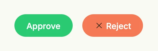
HStack(
	FilledButton(SG0, func() {}).Title("Approve").TextColor(ColorWhite),
	FilledButton(SE0, func() {}).Title("Reject").TextColor(ColorWhite).PreIcon(icons.XMark),
).Gap(L16)
Constructors
| Constructor | Description |
|---|---|
func FilledButton(fillColor Color, action func()) TFilledButton | Creates a filled button with the given background color and action. |
Methods
| Method | Description |
|---|---|
Frame(frame Frame) TFilledButton | Frame sets the layout frame of the button, including size and positioning. |
PostIcon(svg core.SVG) TFilledButton | PostIcon sets the icon displayed after the text label. |
PreIcon(svg core.SVG) TFilledButton | PreIcon sets the icon displayed before the text label. |
TextColor(color Color) TFilledButton | TextColor sets the text color of the button label. |
Title(text string) TFilledButton | Title sets the text label displayed on the button. |
TextColor only applies to the label, the icons keep their default color.