Radio Button Field
A radio button field combines a Radio Button with a label. It takes the RadioStateGroup and
the index of its option, so you do not need to bind the state yourself.
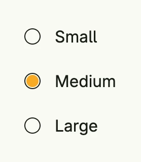
group := AutoRadioStateGroup(wnd, "sizes", 3).InitIndex(1)
labels := []string{"Small", "Medium", "Large"}

VStack(
	Each2(group.All(), func(idx int, checked *core.State[bool]) core.View {
		return RadioButtonField(labels[idx], &group, idx)
	})...,
).Alignment(Leading).Gap(L8)
Read the selection with group.SelectedIndex() or register a callback with group.Observe.
Constructors
| Constructor | Description |
|---|---|
func RadioButtonField(label string, stateGroup *RadioStateGroup, index int) TRadioButtonField | Creates a labeled radio button for the option at index of the group. |
Methods
| Method | Description |
|---|---|
Disabled(disabled bool) TRadioButtonField | Disabled disables the radio button when set to true, preventing user interaction. |
ID(id string) TRadioButtonField | Assigns a unique identifier to the field. |
InputChecked(input *core.State[bool]) TRadioButtonField | InputChecked binds the radio button to the given state, enabling two-way data binding so that the selected state is synchronized with external logic. |
Label(label string) TRadioButtonField | Label sets the label of the radio button field. |
Name(name string) TRadioButtonField | Name assigns a name to the checkbox field, useful for autocomplete. |
Visible(v bool) TRadioButtonField | Visible controls the visibility of the radio button. |
Related
- Radio Button and
RadioStateGroup - Checkbox Field
- Tutorials: Radio button