Text
Text displays a string. It is used for headlines, paragraphs, labels and inline links. Set a Font for the
typographic role, e.g. Title, and a Color for emphasis. A text with an Action or a link becomes interactive.
For formatted HTML content, use Rich Text.
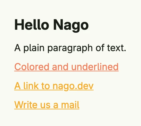
VStack(
	Text("Hello Nago").Font(Title),
	Text("A plain paragraph of text."),
	Text("Colored and underlined").Color(SE0).Underline(true),
	Link(wnd, "A link to nago.dev", "https://www.nago.dev", "_blank"),
	MailTo(wnd, "Write us a mail", "info@example.com"),
).Alignment(Leading).Gap(L8)
Constructors
| Constructor | Description |
|---|---|
func Text(content string) TText | Creates a text with the given content. |
func Link(_ core.Window, text string, href string, target string) TText | Creates a link. An http or https href opens as usual, other paths navigate inside the app without reloading the page. |
func LinkWithAction(text string, action func()) TText | Creates an underlined, interactive text which calls the action when clicked. |
func MailTo(wnd core.Window, name string, email string) TText | Creates a mailto: link which opens the email client of the user. |
Methods
Some setters return DecoredView instead of TText. Call them last in the chain or call the TText setters first.
| Method | Description |
|---|---|
AccessibilityLabel(label string) DecoredView | AccessibilityLabel sets the label of the text. |
Action(f func()) TText | Action executes the function when the component is clicked. |
BackgroundColor(backgroundColor Color) DecoredView | BackgroundColor sets the color of the background. |
Border(border Border) DecoredView | Border draws a Border around the component. |
Color(color Color) TText | Color sets the Color of the font. |
Ellipsis(ellipsis bool) TText | Ellipsis sets the flag to cut of text overflow with ellipsis. |
FocusedBorder(border Border) TText | FocusedBorder sets the Border width, color and radius when the component is focused. |
Font(font Font) TText | Font sets the size, style and width of the Text. |
Frame(frame Frame) DecoredView | Frame sets the width, minWidth, maxWidth, height, minHeight and maxHeight. |
FullWidth() TText | FullWidth sets the width to 100%. |
HoveredBorder(border Border) TText | HoveredBorder sets the Border width, color and radius when component is hovered. |
Hyphens(h Hyphens) TText | Sets the hyphenation mode, e.g. HyphensAuto. |
LabelFor(id string) DecoredView | Makes the text the label of the input element with the given id. |
LineBreak(lb bool) TText | LineBreak de-/activates line breaking in between the Text. |
Link(url, target string) TText | Turns the text into a link to the url, opened in the given browsing context. |
Padding(padding Padding) DecoredView | Padding sets a top, right, bottom and left spacing. |
PressedBorder(border Border) TText | PressedBorder sets the Border width, color and radius when the component is clicked. |
Resolve(b bool) TText | Resolve tries to resolve the current text content against the window bundle at render time to translate its contents. |
Text(content string) TText | Text is a convenience property setter method to set the content for a zero-value Text. |
TextAlignment(align TextAlignment) TText | TextAlignment sets the position of the Text. |
Underline(b bool) TText | Underline underlines the Text. |
Visible(visible bool) DecoredView | Visible decides whether a text is shown. |
WhiteSpace(whiteSpace WhiteSpace) TText | Sets how white space inside the text is handled. |
WithFrame(fn func(Frame) Frame) DecoredView | WithFrame sets width, minWidth, maxWidth, height, minHeight and maxHeight using a function. |
WordBreak(wordBreak WordBreak) TText | Sets where lines may break inside words. |
Related
- Rich Text
- Button
- Tutorials: Hello World, Typography, List