Avatar Picker
The avatar picker shows an avatar together with a button to upload a new image or to remove the current one. Uploaded images are stored by the image management, and the state receives the ID of the new image.
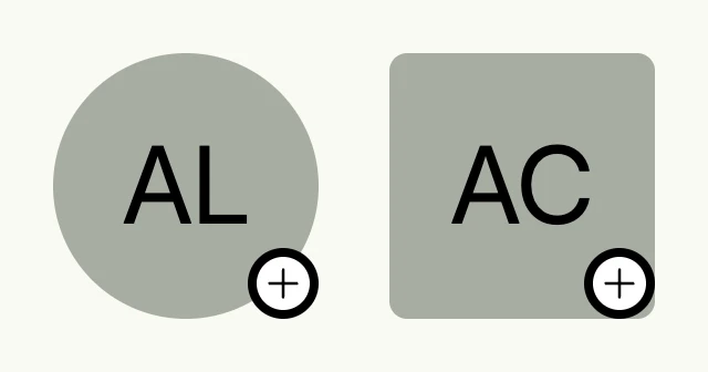
// createSrcSet is the CreateSrcSet use case of cfg.ImageManagement(), see the note below.
var createSrcSet image.CreateSrcSet

func view(wnd core.Window) core.View {
    img := core.AutoState[image.ID](wnd)

    return HStack(
        form.AvatarPicker(wnd, createSrcSet, "profile-image", img.Get(), img, "Ada Lovelace", avatar.Circle),
        form.AvatarPicker(wnd, createSrcSet, "logo", img.Get(), img, "Acme Corp", avatar.Rounded),
    ).Gap(L32)
}
Pass the CreateSrcSet use case of cfg.ImageManagement(), or nil to resolve it from the window
context. The latter requires that the image management is enabled, e.g. by cfg.StandardSystems().
Constructors
func AvatarPicker(wnd core.Window, setCreator image.CreateSrcSet, selfId string, id image.ID, state *core.State[image.ID], paraphe string, style avatar.Style) TAvatarPickerAvatarPicker creates a new TAvatarPicker with the given parameters.
Methods
| Method | Description |
|---|---|
AccessibilityLabel(label string) ui.DecoredView | AccessibilityLabel sets the accessibility label for screen readers. |
Border(border ui.Border) ui.DecoredView | Border sets the border styling of the avatar picker. |
Enabled(b bool) TAvatarPicker | Enabled enables or disables the user interaction. |
Frame(frame ui.Frame) ui.DecoredView | Frame sets the frame of the avatar picker directly. |
Padding(padding ui.Padding) ui.DecoredView | Padding sets the padding around the avatar picker. |
Visible(visible bool) ui.DecoredView | Visible toggles the visibility of the avatar picker. |
WithFrame(fn func(ui.Frame) ui.Frame) ui.DecoredView | WithFrame updates the frame of the avatar picker using a frame transformation function. |