Data View
The data view presents a collection as table, cards or list, depending on the window size, and adds
search, sorting, selection and a create button. FromSlice works on a plain slice, FromData loads the
entries of a repository or use case by ID. It is the standard view for overview pages of entities.
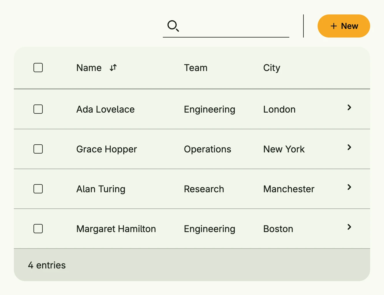
func view(wnd core.Window) core.View {
    type employee struct {
        Name, Team, City string
    }

    employees := []employee{
        {"Ada Lovelace", "Engineering", "London"},
        {"Grace Hopper", "Operations", "New York"},
        {"Alan Turing", "Research", "Manchester"},
        {"Margaret Hamilton", "Engineering", "Boston"},
    }

    type E = dataview.Element[employee]

    return dataview.FromSlice(wnd, employees, []dataview.Field[E]{
        {
            ID:   "name",
            Name: "Name",
            Map:  func(e E) core.View { return Text(e.Value.Name) },
            Comparator: func(a, b E) int {
                return strings.Compare(a.Value.Name, b.Value.Name)
            },
        },
        {
            ID:   "team",
            Name: "Team",
            Map:  func(e E) core.View { return Text(e.Value.Team) },
        },
        {
            ID:   "city",
            Name: "City",
            Map:  func(e E) core.View { return Text(e.Value.City) },
        },
    }).
        Search(true).
        Selection(true).
        CreateAction(func() {
            // open a create dialog
        }).
        Action(func(e E) {
            // open the details of e.Value
        })
}
Sorting
A field with a Comparator gets a sort control, which sorts ascending and, on the next click, descending by
negating the comparator. Entries for which Empty reports true stay at the end in both directions, in their
original order:
{
    ID:         "due",
    Name:       "Due",
    Map:        func(e E) core.View { return Text(e.Value.Due.String()) },
    Comparator: func(a, b E) int { return a.Value.Due.Compare(b.Value.Due) },
    Empty:      func(e E) bool { return e.Value.Due.IsZero() },
}
A field without a Name gets no sort control.
Wide tables
A table with many columns may be wider than the window. With TableOptions{MinWidth: "1800px"} only the table
scrolls horizontally, while the search, the options, the create button and the pager keep the width of the
view.
Constructors
func FromData[E data.Aggregate[ID], ID ~string](wnd core.Window, data Data[E, ID]) TDataView[E, ID]FromData creates a data view which loads its entries by ID, see Data.
func FromModel[E data.Aggregate[ID], ID ~string](wnd core.Window, model pager.Model[E, ID], fields []Field[E]) TDataView[E, ID]FromModel creates a data view from an existing pager model.
func FromSlice[T any](wnd core.Window, slice []T, fields []Field[Element[T]]) TDataView[Element[T], Idx]FromSlice takes the given slice of T and wraps it into an index Element box, so that the identity is based on the index within the slice.
Methods
| Method | Description |
|---|---|
Action(fn func(e E)) TDataView[E, ID] | Action sets a global listener which is triggered, if an entry has been clicked. |
ActionBarContent(content core.View) TDataView[E, ID] | ActionBarContent allows the user to set some custom content to be shown in the action bar e.g., a short description. |
CardOptions(cardOptions CardOptions) TDataView[E, ID] | CardOptions configures the card style. |
CreateAction(fn func()) TDataView[E, ID] | CreateAction is a conventional default factory to create a new element for this data view. |
CreateActionView(view core.View) TDataView[E, ID] | CreateActionView inserts the given view to idiomatic position for creating new elements. |
CreateOptions(actions ...CreateOption) TDataView[E, ID] | CreateOptions is default factory for [TDataView.NewActionView]. |
ListOptions(listOptions ListOptions[ID]) TDataView[E, ID] | ListOptions configures the list style. |
ModelOptions(opts pager.ModelOptions) TDataView[E, ID] | ModelOptions sets the internal model options used to render directly. |
NextActionIndicator(b bool) TDataView[E, ID] | NextActionIndicator sets a flag if another column should be appended to indicate that an entry has an attached next-action. |
Search(visible bool) TDataView[E, ID] | Search shows or hides the search field. |
SelectOptions(options ...SelectOption[ID]) TDataView[E, ID] | SelectOptions adds a default options button, which is enabled if at least a single item is selected. |
Selection(showSelection bool) TDataView[E, ID] | Selection enabled the flag to show or hide data selection. |
SelectionChanged(fn func([]ID)) TDataView[E, ID] | SelectionChanged sets a callback which is triggered when the selection of this data view has changed. |
Style(style Style) TDataView[E, ID] | Style selects Auto, Table, Card or List; Auto picks by window size. |
TableOptions(tableOptions TableOptions) TDataView[E, ID] | TableOptions configures the table style. |