Flow Chart
The flow chart draws nodes and connecting edges on a zoomable canvas. Describe the graph as a
flowchart.Model, and enable the interactions you need: dragging nodes, connecting them, selecting
elements. Replace the default node rendering with CustomContents to show arbitrary views inside the
nodes.
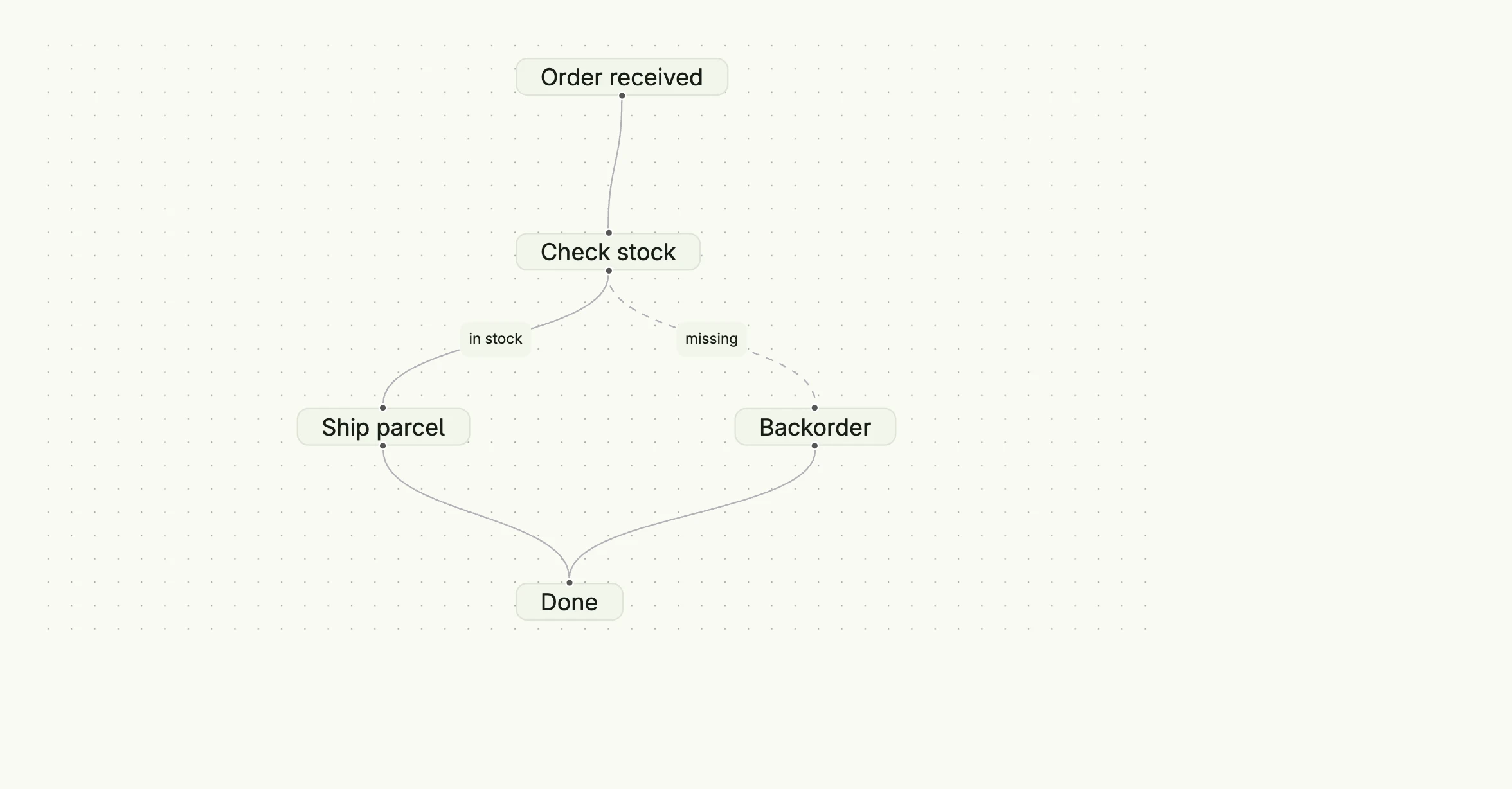
func view(wnd core.Window) core.View {
    model := flowchart.Model{
        Nodes: []flowchart.Node{
            {ID: "order", Label: "Order received", Type: flowchart.NodeTypeStart, Position: flowchart.Point{X: 200, Y: 0}},
            {ID: "check", Label: "Check stock", Position: flowchart.Point{X: 200, Y: 120}},
            {ID: "ship", Label: "Ship parcel", Position: flowchart.Point{X: 50, Y: 240}},
            {ID: "backorder", Label: "Backorder", Position: flowchart.Point{X: 350, Y: 240}},
            {ID: "done", Label: "Done", Type: flowchart.NodeTypeEnd, Position: flowchart.Point{X: 200, Y: 360}},
        },
        Edges: []flowchart.Edge{
            {ID: "e1", SourceNodeID: "order", TargetNodeID: "check"},
            {ID: "e2", SourceNodeID: "check", TargetNodeID: "ship", Label: "in stock"},
            {ID: "e3", SourceNodeID: "check", TargetNodeID: "backorder", Label: "missing", Animated: true},
            {ID: "e4", SourceNodeID: "ship", TargetNodeID: "done"},
            {ID: "e5", SourceNodeID: "backorder", TargetNodeID: "done"},
        },
    }

    return flowchart.FlowChart(model).
        Layout(flowchart.FlowChartLayoutVertical).
        NodesDraggable(true).
        Background(flowchart.Background{GridGap: 16}).
        Frame(Frame{Width: L880, Height: L480})
}
Bind a *core.State[flowchart.Model] with InputValue to keep the positions of dragged nodes, and a
state with ActionValue to react to clicks.
Constructors
func FlowChart(model Model) TFlowChartFlowChart creates a new flowchart component for the given model.
Methods
| Method | Description |
|---|---|
ActionValue(state *core.State[FlowChartActionData]) TFlowChart | ActionValue binds a state which receives the latest user interaction, e.g. a clicked node or edge. |
AppendCustomContent(content CustomContent) TFlowChart | AppendCustomContent adds a custom view for a node. |
AutoLayout(wnd core.Window) | AutoLayout asks the frontend to arrange all nodes automatically. |
Background(background Background) TFlowChart | Background sets the background color and grid. |
CustomContents(contents []CustomContent) TFlowChart | CustomContents replaces the default node rendering with custom views. |
EdgesEditable(val bool) TFlowChart | EdgesEditable allows the user to change edges. |
ElementsSelectable(val bool) TFlowChart | ElementsSelectable allows the user to select nodes and edges. |
Frame(frame ui.Frame) TFlowChart | Frame sets the layout frame. |
FullWidth() TFlowChart | FullWidth expands the component to the full available width. |
InputValue(input *core.State[Model]) TFlowChart | InputValue binds the flowchart to a stateful model. |
Layout(layout FlowChartLayout) TFlowChart | Layout sets the direction, horizontal or vertical, used to attach edges and for the auto layout. |
MaxZoom(maxZoom float64) TFlowChart | MaxZoom sets the maximum zoom factor. |
Menu(menu Menu) TFlowChart | Menu sets a context menu for the chart. |
MinZoom(minZoom float64) TFlowChart | MinZoom sets the minimum zoom factor. |
Model(model Model) TFlowChart | Model sets the static flowchart model. |
Movable(val bool) TFlowChart | Movable allows the user to pan the chart. |
NodesConnectable(val bool) TFlowChart | NodesConnectable allows the user to connect nodes. |
NodesDraggable(val bool) TFlowChart | NodesDraggable allows the user to move nodes. |
ReadOnly(val bool) TFlowChart | ReadOnly disables all user modifications. |
Toolbar(toolbar Toolbar) TFlowChart | Toolbar configures the toolbar and its actions. |
WithFrame(fn func(ui.Frame) ui.Frame) TFlowChart | WithFrame transforms the current frame with the given function. |
Related
- Tree View
- Tutorial tutorial-98-flow-chart