Palette Picker
The palette picker selects a color from a predefined palette. The field shows the current color, a
click opens a dialog with the palette. colorpicker.DefaultPalette contains a balanced set of colors.
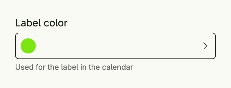
func view(wnd core.Window) core.View {
    color := core.AutoState[Color](wnd).Init(func() Color { return colorpicker.DefaultPalette[3] })

    return colorpicker.PalettePicker("Label color", colorpicker.DefaultPalette).
        Value(color.Get()).
        State(color).
        Title("Choose a color").
        SupportingText("Used for the label in the calendar").
        Frame(Frame{Width: L320})
}
Constructors
func PalettePicker(label string, p Palette) TPalettePickerPalettePicker creates a color picker with the given label which offers the colors of the palette, e.g.
colorpicker.DefaultPalette.
Methods
| Method | Description |
|---|---|
AccessibilityLabel(label string) ui.DecoredView | AccessibilityLabel sets the label for screen readers. |
Border(border ui.Border) ui.DecoredView | Border sets the border. |
Dialog(pickerPresented *core.State[bool]) core.View | Dialog returns the dialog view as if pressed on the actual button. |
Disabled(disabled bool) TPalettePicker | Disabled disables the user interaction. |
ErrorText(text string) TPalettePicker | ErrorText sets a validation message below the field. |
Frame(frame ui.Frame) ui.DecoredView | Frame sets the layout frame. |
Padding(padding ui.Padding) ui.DecoredView | Padding sets the inner padding. |
State(state *core.State[ui.Color]) TPalettePicker | State attaches the given state to the interaction process of selecting a value. |
SupportingText(text string) TPalettePicker | SupportingText sets a hint below the field. |
Title(title string) TPalettePicker | Title sets the title of the palette dialog. |
Value(color ui.Color) TPalettePicker | Value sets the selected value. |
Visible(visible bool) ui.DecoredView | Visible shows or hides the component. |
WithFrame(fn func(ui.Frame) ui.Frame) ui.DecoredView | WithFrame transforms the current frame with the given function. |
Related
- Picker
- Tutorial tutorial-33-colorpicker