Grid
A grid arranges grid cells in rows and columns. For simple cases set the number of columns and add the cells in reading order; cells can span several columns or rows. For overlapping or sparse layouts, set rows, columns and the start and end positions of each cell explicitly.
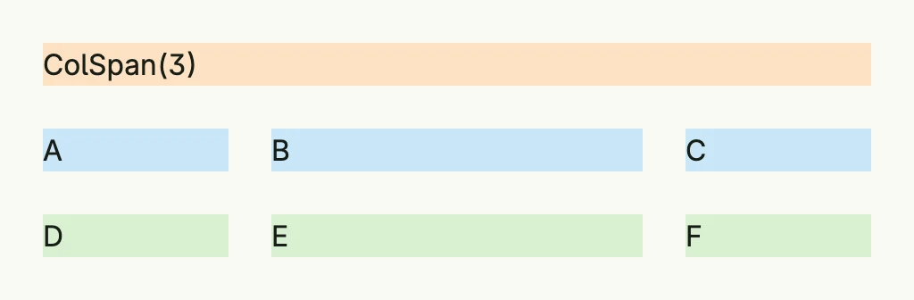
return Grid(
	GridCell(Text("ColSpan(3)")).ColSpan(3).BackgroundColor("#FDE2C4").Padding(Padding{}.All(L8)),
	GridCell(Text("A")).BackgroundColor("#C9E7F8").Padding(Padding{}.All(L8)),
	GridCell(Text("B")).BackgroundColor("#C9E7F8").Padding(Padding{}.All(L8)),
	GridCell(Text("C")).BackgroundColor("#C9E7F8").Padding(Padding{}.All(L8)),
	GridCell(Text("D")).BackgroundColor("#D8F0D2").Padding(Padding{}.All(L8)),
	GridCell(Text("E")).BackgroundColor("#D8F0D2").Padding(Padding{}.All(L8)),
	GridCell(Text("F")).BackgroundColor("#D8F0D2").Padding(Padding{}.All(L8)),
).Columns(3).
	Gap(L8).
	Widths(L120, "1fr", L120).
	Frame(Frame{Width: L480})
Widths and Heights take any Length; the CSS fraction unit fr distributes the
remaining space.
Constructors
| Constructor | Description |
|---|---|
Grid(cells ...TGridCell) TGrid | Creates a new grid containing the given cells. |
Methods
| Method | Description |
|---|---|
AccessibilityLabel(label string) DecoredView | Sets the accessibility label of the grid, used by screen readers. |
Append(cells ...TGridCell) TGrid | Adds one or more cells to the grid. |
BackgroundColor(backgroundColor Color) DecoredView | Sets the background color of the grid. |
Border(border Border) DecoredView | Sets the border styling of the grid. |
ColGap(g Length) TGrid | Sets the horizontal spacing between columns in the grid. |
Columns(cols int) TGrid | Sets the amount of columns explicitly. |
Font(font Font) DecoredView | Sets the font style applied to text inside the grid. |
Frame(fr Frame) DecoredView | Sets the layout frame of the grid, including size and positioning. |
FullWidth() TGrid | Sets the grid to span the full available width. |
Gap(g Length) TGrid | Sets RowGap and ColGap equally. |
Heights(rowHeights ...Length) TGrid | Sets optional row heights from top to bottom. |
Padding(padding Padding) DecoredView | Sets the inner spacing around the grid. |
RowGap(g Length) TGrid | Sets the vertical spacing between rows in the grid. |
Rows(rows int) TGrid | Sets the amount of rows explicitly. |
Visible(visible bool) DecoredView | Controls the visibility of the grid; setting false hides it. |
Widths(colWidths ...Length) TGrid | Sets optional column widths from left to right; undefined widths share the remaining space. |
WithFrame(fn func(Frame) Frame) DecoredView | Applies a transformation function to the grid’s frame and returns the updated component. |
Related
- Grid Cell, Card Layout, Table
- Tutorials: Gantt grid, Responsive, Grid