Table Column
A table column defines the header cell of one column of a Table and the column width. Its alignment, background, padding and border apply to the header cell; style the body cells with TableCell. A column action is typically used for sorting.
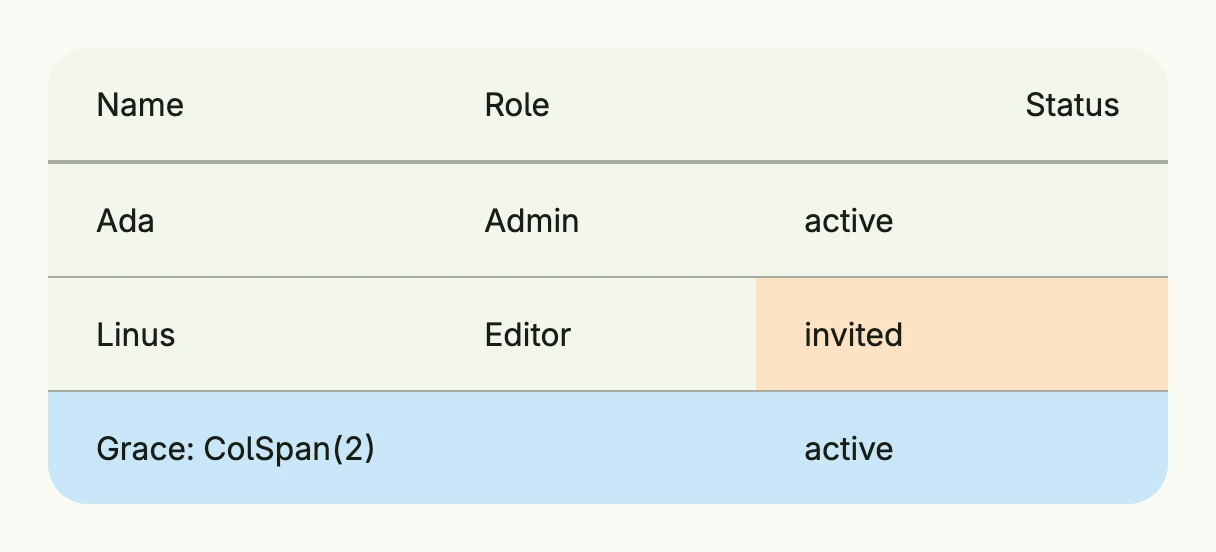
return Table(
	TableColumn(Text("Name")),
	TableColumn(Text("Role")).Width(L160),
	TableColumn(Text("Status")).Alignment(Trailing),
).Rows(
	TableRow(
		TableCell(Text("Ada")),
		TableCell(Text("Admin")),
		TableCell(Text("active")),
	),
	TableRow(
		TableCell(Text("Linus")),
		TableCell(Text("Editor")),
		TableCell(Text("invited")).BackgroundColor("#FDE2C4"),
	).HoveredBackgroundColor(ColorCardFooter),
	TableRow(
		TableCell(Text("Grace: ColSpan(2)")).ColSpan(2),
		TableCell(Text("active")),
	).BackgroundColor("#C9E7F8"),
).Frame(Frame{Width: L560})
Constructors
| Constructor | Description |
|---|---|
TableColumn(content core.View) TTableColumn | Creates a new table column with the given header content. |
Methods
| Method | Description |
|---|---|
Action(action func()) TTableColumn | Sets an optional click/tap action for the column’s header cell. |
Alignment(alignment Alignment) TTableColumn | Sets the content alignment within the column cell. |
BackgroundColor(backgroundColor Color) TTableColumn | Sets the background color for the column cell. |
Border(border Border) TTableColumn | Sets the border for the column cell. |
Content(content core.View) TTableColumn | Replaces the header content. |
HoveredBackgroundColor(backgroundColor Color) TTableColumn | Sets the background color when the column cell is hovered. |
Key(name, id string) TTableColumn | Identifies the action across renders by what it acts on, e.g. (“sort”, column). |
Padding(padding Padding) TTableColumn | Sets the padding for the column cell. |
Span(span int) TTableColumn | Sets how many columns this header should span. |
Width(width Length) TTableColumn | Sets the column width. |
Related
- Table, Table Row, Table Cell
- Tutorials: Table