Custom Button
Builds a button from a VStack with an action and its own colors and borders for the hovered, pressed and
focused state.
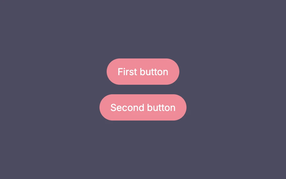
package main

import (
	"fmt"
	"go.wdy.de/nago/application"
	"go.wdy.de/nago/presentation/core"
	. "go.wdy.de/nago/presentation/ui"
	"go.wdy.de/nago/web/vuejs"
)

func main() {
	application.Configure(func(cfg *application.Configurator) {
		cfg.SetApplicationID("de.worldiety.tutorial")
		cfg.Serve(vuejs.Dist())

		cfg.RootView(".", func(wnd core.Window) core.View {
			return VStack(
				MyButton("First button", func() {
					fmt.Println("clicked 1")
				}),
				MyButton("Second button", func() {
					fmt.Println("clicked 2")
				}),
			).Gap(L16).BackgroundColor("#4C4B5F").Frame(Frame{}.MatchScreen())
		})
	}).Run()
}

func MyButton(caption string, action func()) core.View {
	return VStack(Text(caption).Color("#ffffff")).Action(action).
		HoveredBackgroundColor(Color("#EF8A97").WithTransparency(10)).
		PressedBackgroundColor(Color("#EF8A97").WithTransparency(25)).
		PressedBorder(Border{}.Circle().Color("#ffffff").Width(L2)).
		FocusedBorder(Border{}.Circle().Color("#ffffff").Width(L2)).
		BackgroundColor("#EF8A97").
		Padding(Padding{}.Horizontal(L16).Vertical(L8)).
		Border(Border{}.Circle().Color("#00000000").Width(L2)) // add invisible default border, to avoid dimension changes
}
View on GitHub ↗
· run it with go run go.wdy.de/nago/example/cmd/tutorial-09-custom-button@latest